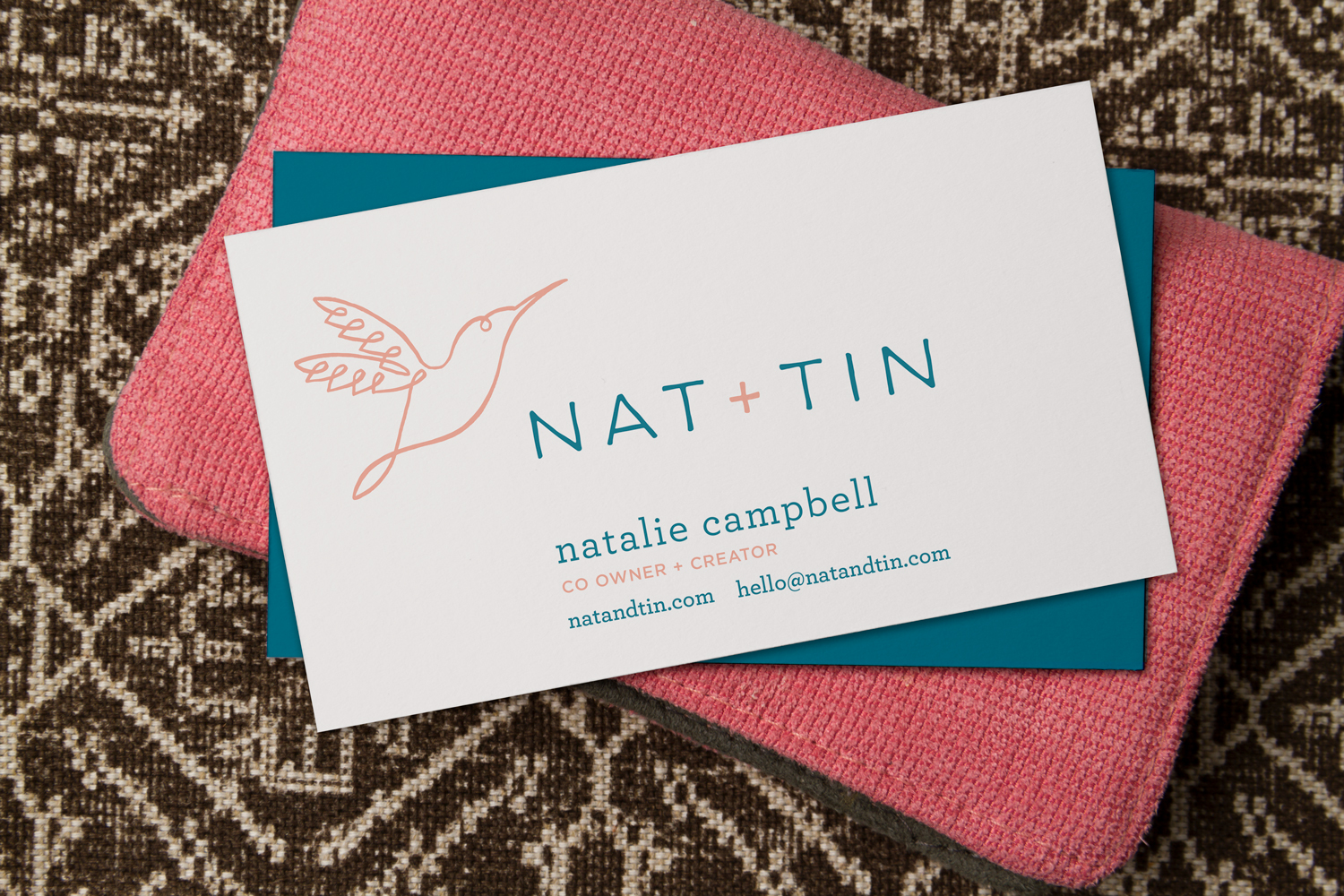
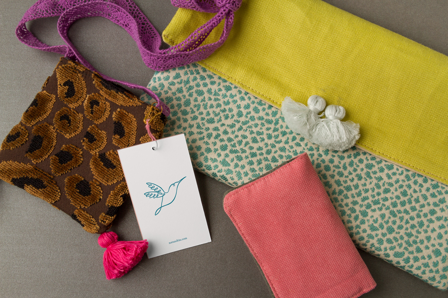
If you appreciate fine craftsmanship and the concept of upcycling, you’ll appreciate our new client Nat+Tin, a Dallas business that’s helping make the world a more beautiful place, one custom handbag at a time. Two creative mothers with a desire to channel their unique sense of style and taste, the owners of Nat+Tin transform high-quality remnant fabric pieces into one-of-a-kind clutches, wallets, pillows and more. In an effort to elevate their brand to reflect the unique handcrafted quality of their products, they contacted B+C to create a new logo. The selected design has a slightly feminine tone, and beautifully complements the look and feel of their handiwork. You can grab your own timeless piece at natandtin.com.


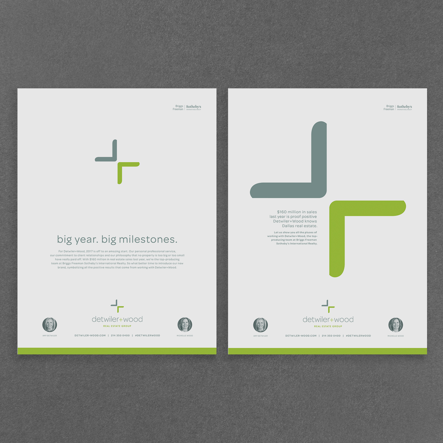
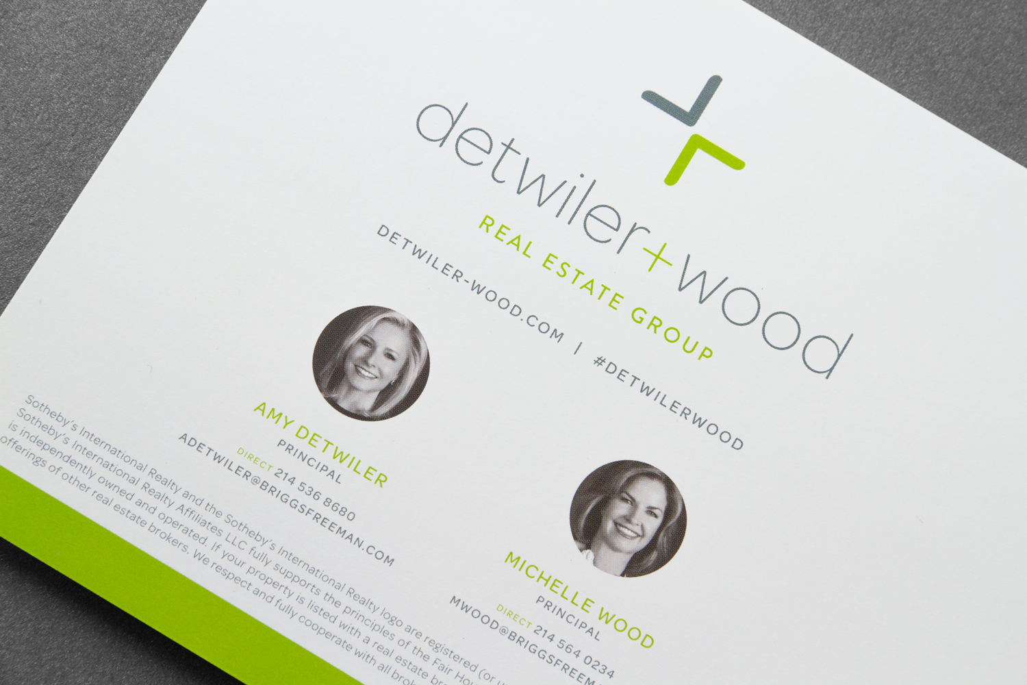
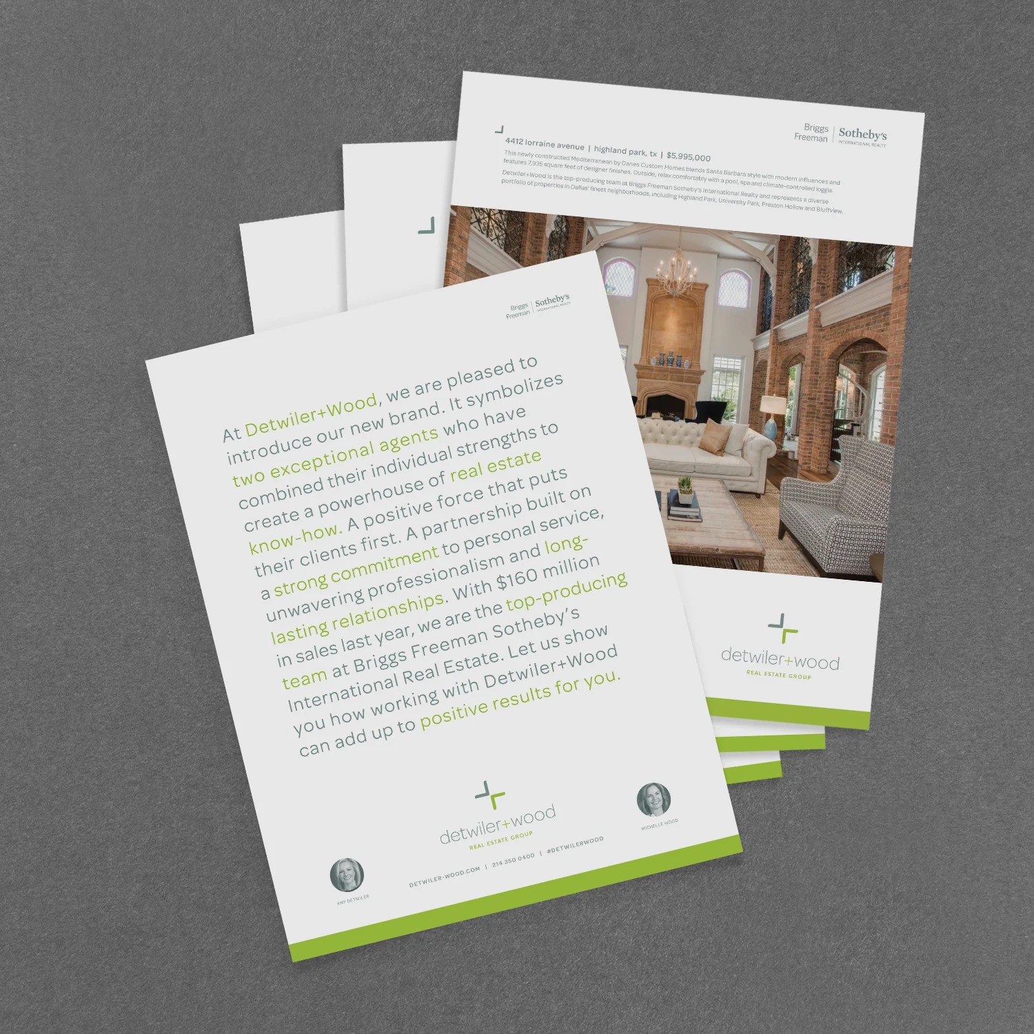
Detwiler+Wood: Positive Outcomes of New Branding Project
The Banowetz Team recently had the exciting opportunity to work with Dallas real estate experts Detwiler+Wood on their new branding and advertising efforts. This firm is actually the result of a long-standing professional collaboration between Amy Detwiler and Michelle Wood, who were the top-producing team at Briggs Freeman Sotheby’s International Realty last year. Amy and Michelle were looking to officially brand their partnership and mark this significant milestone with a multi-faceted marketing effort. Banowetz + Company created their new logo and an attention-getting direct mail, digital and print ad campaign to announce the new brand and communicate all the pluses of working with this real estate powerhouse.


— Team Banowetz
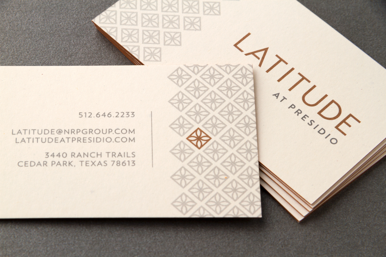
Lines Leading Home: Branding Latitude at Presidio
Our client, the NRP Group, is busy as ever, creating beautiful new properties in growing cities throughout the country. Recently, Banowetz + Company named and branded NRP's newest offering, a luxury apartment community in a mixed-use development located in Cedar Park, Texas, on the north side of Austin. Taking inspiration from the structure's modern facade and strong linear features, we landed on the name "Latitude." Complementing the linear theme, we designed a logotype that was strong, yet understated. Brand colors, colored paper and metallic inks were chosen to reflect the contrasting neutrals of the property, bringing a natural quality and earthy tones into the collateral. The end result was a clean aesthetic that added sophistication to an already stunning community.


— Team Banowetz