
Check out Banowetz + Company’s latest branding project for Tyrrell Boruff, a family-owned asset management and operating company. A custom icon was created by merging the first letters of the company name, which is a combination of the wife’s maiden name and the husband’s family name. The use of lowercase typography gives the brand a friendly and approachable feel, while corporate blue tones add a level of professionalism. Collateral pieces were letterpress printed by Lilco, and edge painting ensures a great first impression.


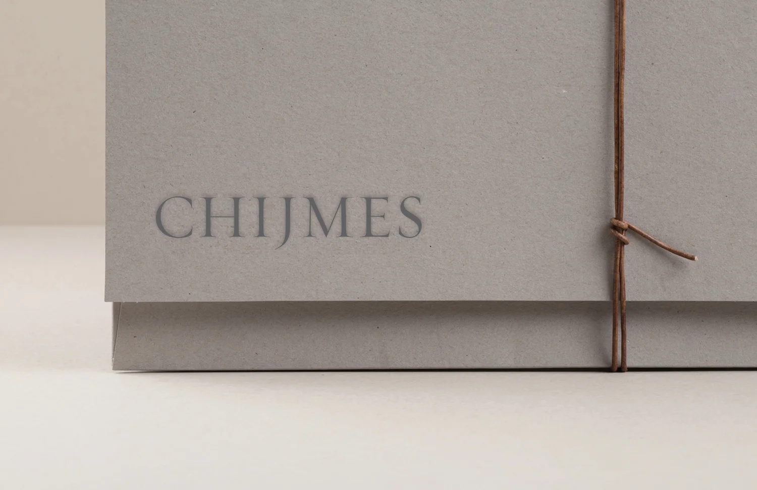
A New Dallas Destination: Banowetz Helps Put CHIJMES on the Map

Banowetz + Company recently helped the owners of a new boutique hotel and event space navigate their way through the process of creating a look and feel for their brand. A revitalized 1940s chapel in the eclectic Bishop Arts District of Oak Cliff in Dallas with interiors inspired by the world-travelings of the creators, CHIJMES is a destination in and of itself. Twelve themed rooms take guests on an immersive journey around the globe, and the one-of-a-kind chapel, meeting spaces and outdoor areas are ideal for unique weddings and special occasions. B+C collaborated closely with the owners to develop a logo, tagline, collateral and website that capture the spirit of wanderlust and discovery they hoped to convey. The final design and simple messaging are a sophisticated, understated complement to this beautiful venue.
— Team Banowetz


An Elevated Look: B+C Branding for The Flats at 901
Refined, timeless and contemporary. That’s the look and feel of the most recent apartment community in Euless, Texas, by The NRP Group. We had the pleasure of partnering with NRP to name, brand and market their newest development located near DFW Airport. Taking inspiration from the design of the property, the branding is modern and geometric, mixing warm earthy tones from the exterior facade with cool soothing blues from the resort-inspired pool. The final design, with its water-like graphics, makes an inviting presentation and a great impression.


