• Services / Areas of Expertise
  • Clients
  • Testimonials
  • Profiles
  • Logos
  • Print
  • Advertising
  • Dimensional
  • Digital
  • Broadcast
  • Case Studies
  • Legacy Work
  • CONTACT
  • BLOG
Menu

Banowetz + Company, Inc.

3809 Parry Avenue, Suite 208
Dallas, TX 75226
214.823.7300
branding, graphic design & advertising

Banowetz + Company, Inc.

  • ABOUT
    • Services / Areas of Expertise
    • Clients
    • Testimonials
    • Profiles
  • PORTFOLIO
    • Logos
    • Print
    • Advertising
    • Dimensional
    • Digital
    • Broadcast
    • Case Studies
    • Legacy Work
  • CONTACT
  • BLOG

Banowetz + Company Sinks Its Teeth into Landshark Branding

March 20, 2020 Wes Phelan
Landshark_Hdr.jpg

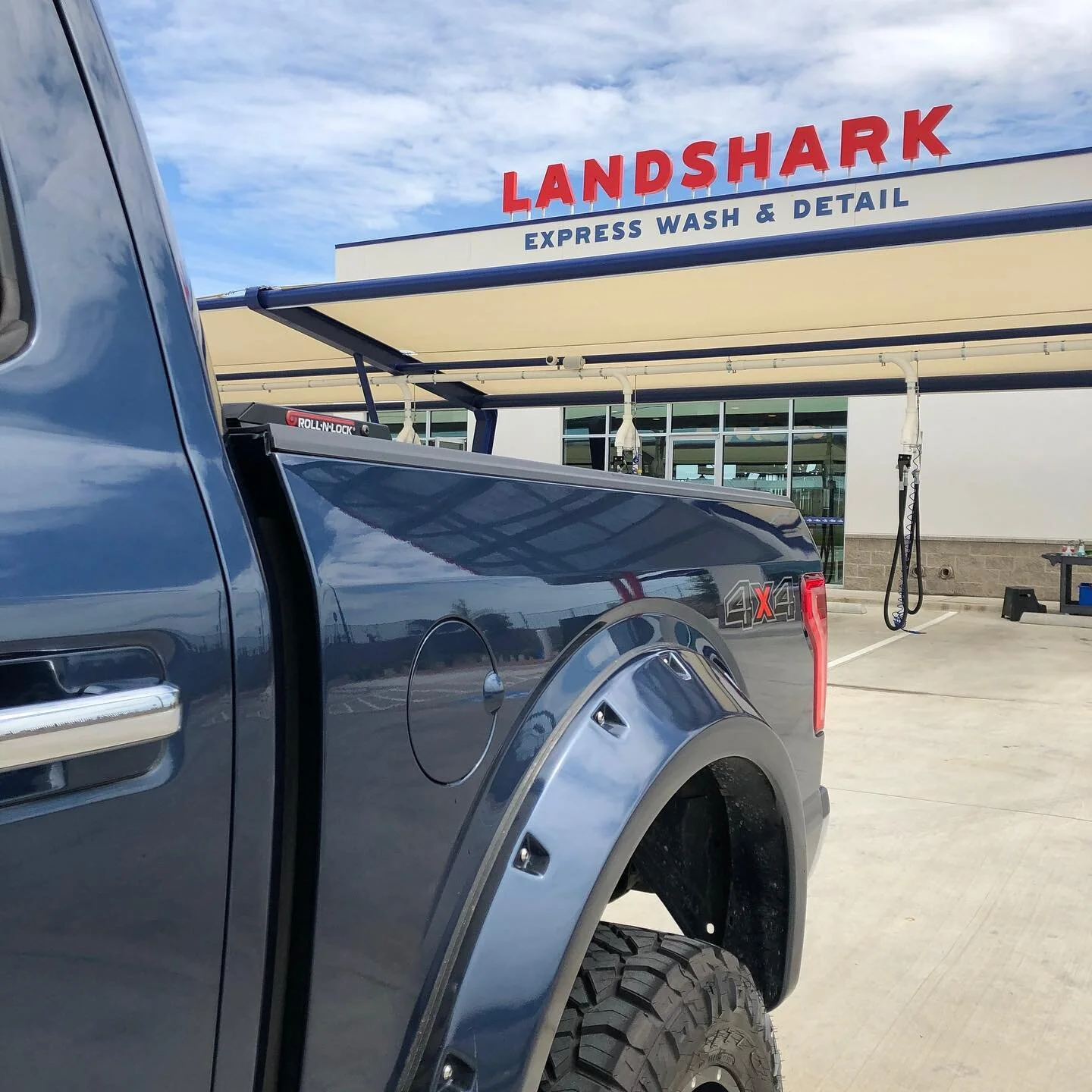
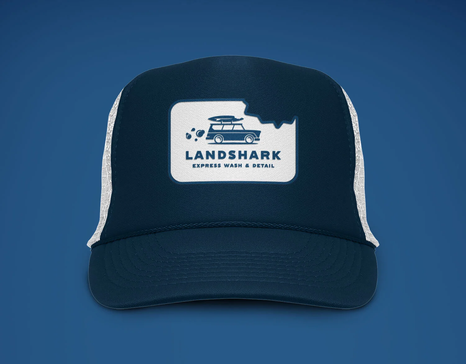
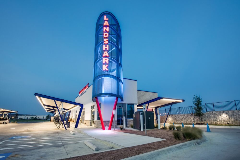
Banowetz + Company recently developed the branding for Landshark Express Wash & Detail, a fast and comprehensive automotive cleaning service based in Fort Worth, Texas. The Landshark development team wanted to create a streamlined car wash experience like no other, with retro-inspired architecture and a guest waiting area featuring a “shark tank” for kids and kids at heart. B+C developed the name Landshark, which implies tenacity and speed, and imagined the car wash as a gathering place for dirty, street-faring predators. To match the unconventional experience and memorable concept, an icon system of 30 sudsy, retro vehicles topped with shark-bitten surfboards was designed to emphasize the wide array of customer types they service, including the signature “woody wagon” as a family-friendly primary mark. Flowing with personality, the branding showcases a collection of overlapping illustrations and clever messaging applied to collateral, wearables, and customer swag. Finally, Banowetz + Company developed a comprehensive website to showcase the unique experience and capture the brand’s friendly, retro aesthetics.

In a sea of like-minded competitors, the Landshark brand is a prize catch.

Landshark-Logo-01.jpg
Landshark_CaseStudy_2.jpg
BusinessCard4-HighRes-LS.jpg
o (29).jpg
EnamelPins-HighRes.jpg
95042757_221964525918539_968855527176011776_o.jpg
Hat-HighRes.jpg
Notecard2-HighRes-LS.jpg
o.jpg
Letterhead3-HighRes-LS.jpg
Homepage-HighRes.gif
Shirts-HighRes.jpg
o (2).jpg
Landshark_CaseStudy_7.jpg
In New Work Tags Landshark, Express, Wash, Detailing, Design, Branding, Signage, Website

B+C’s Artful Branding for Sloane’s Corner

January 22, 2020 Wes Phelan
SloanesCorner_Hdr2.jpg

Situated in the Trammell Crow Center in the Dallas Arts District, Sloane’s Corner is a comfortable Downtown Dallas eatery serving New American Bistro fare and craft cocktails. Having partnered with the NL Group on many culinary projects, including Dish and The Front Room, Banowetz + Company was eager to lend our perspective and creativity to launch this new dining experience. Named after the owner’s eight-year old daughter, B+C created a warm and inviting signature script as the main brand element and infused gestural paint splotches as an artful nod to the restaurant’s location. Pairing whimsical and elegant aesthetics, B+C rounded out the brand touchpoints with an array of restaurant signage and collateral, including menus, takeaway packaging, and business cards. The resulting brand and experience are equally modern and playful.

Sloanes-Logo.jpg
 
BusinessCard-HighRes.jpg
Coasters-HighRes.jpg
1-1.jpg
110619_SloanesCorner_KathyTran_QK6A4708.jpg
Menus-HighRes2.jpg
PlasticCups-HighRes.jpg
110619_SloanesCorner_KathyTran_QK6A4833.jpg
Napkins-HighRes.jpg
110719_SloanesCorner_Interiors_KathyTran_QK6A5816.jpg
Menus-HighRes.jpg
110619_SloanesCorner_KathyTran_QK6A4869.jpg
TickerTapeGraphic-01.jpg
In New Work Tags Sloane's, Corner, Restaurant, Branding, Design, Website, Collateral, Menu Design, Menu

A Trusted Partner: B+C Brands Three Oaks Hospice

September 25, 2019 Wes Phelan
ThreeOaks_Hdr2.jpg

With a collective 100+ years of experience in the hospice industry, Three Oaks Hospice recently partnered with Banowetz + Company to launch their brand within the in-home hospice and palliative care space. With a steadfast promise to listen, care, and serve patients and their families during a critical time of life, B+C carefully crafted branding, collateral, and a website to emphasize the company’s mission. The identity features a strong oak tree with three dominant leaves, representing the three pillars of the Three Oaks brand, amid a cluster of smaller leaves, all of which surround a house-shaped icon as the trunk of the tree. This simple and powerful presentation represents the network of support provided to a patient during their end-of-life journey. Banowetz + Company developed the corporate website as a digital centerpiece for the brand, complete with clear and caring messaging, friendly custom illustrations, and easily accessible resources.

ThreeOaksHospice-Logo-01.jpg
BusinessCard-HighRes.jpg
Envelope2-HighRes.jpg
Letterhead-HighRes.jpg
Notepad-HighRes.jpg
TO-2.jpg
TO-1.jpg
Folder-HighRes.jpg
Webiste_Layout-01.jpg
Webiste_Layout-04.jpg
Webiste_Layout-03.jpg
In New Work Tags Three, Oaks, Hospice, New, Work, Branding, Collateral, Website, Design
Older Posts →

Email Us  |  Facebook  |  Twitter  |  Dribbble  |  214.823.7300  |  3809 Parry Avenue, Suite 208, Dallas, Texas 75226  |  © Banowetz + Company, Inc. Email Us
Facebook  |  Twitter  |  Dribbble
214.823.7300
3809 Parry Avenue, Suite 208,
Dallas, Texas 75226
© Banowetz + Company, Inc.