
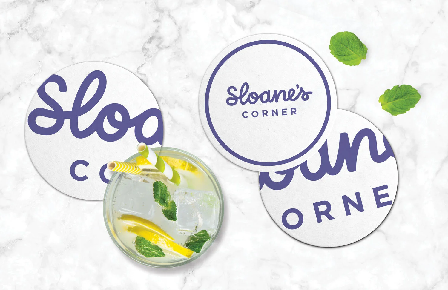
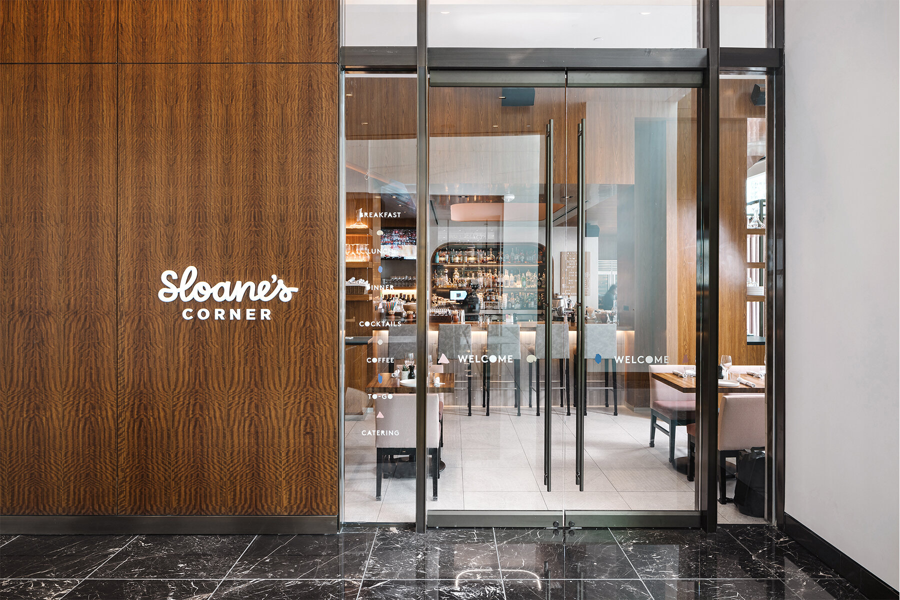
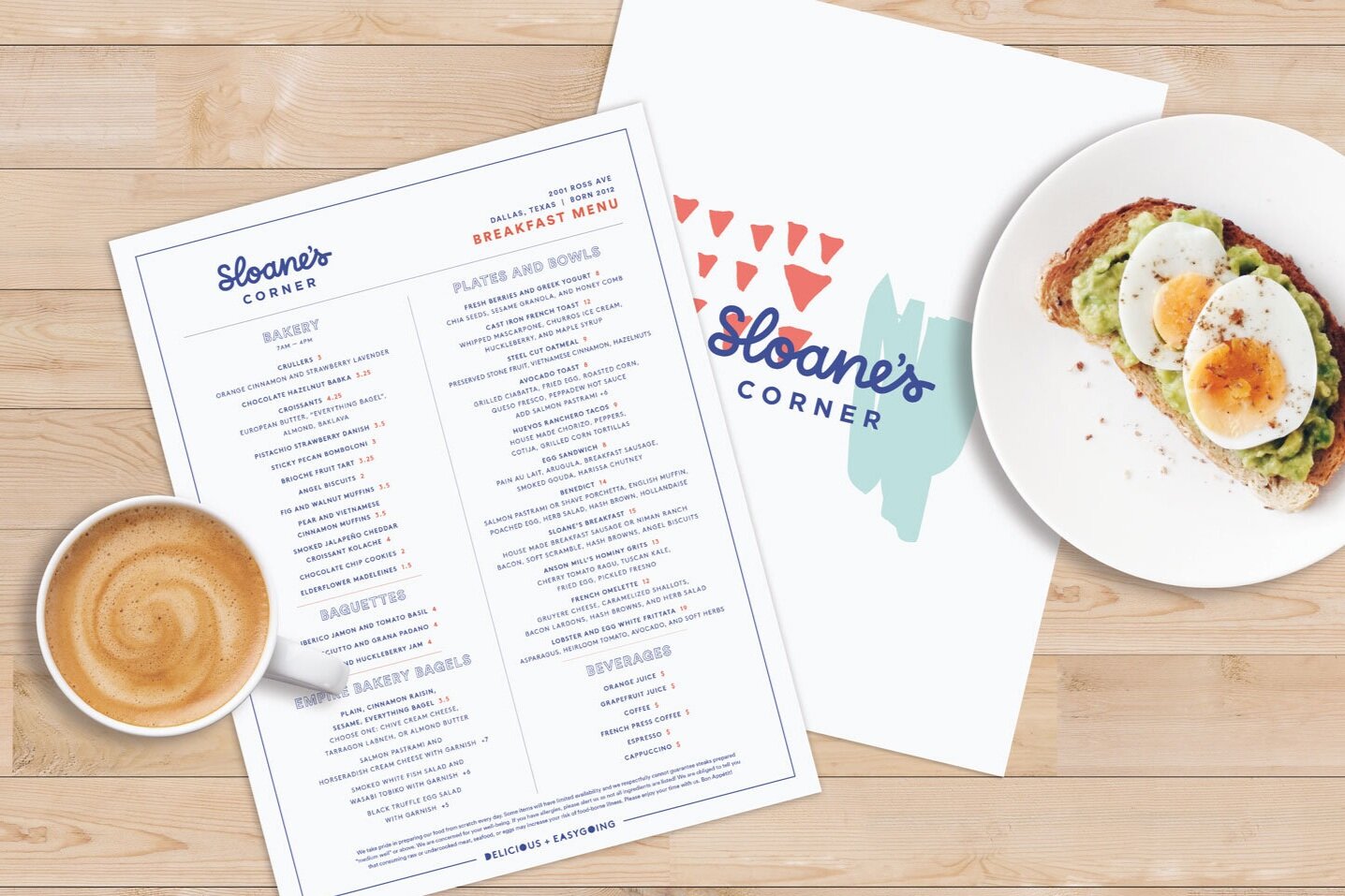
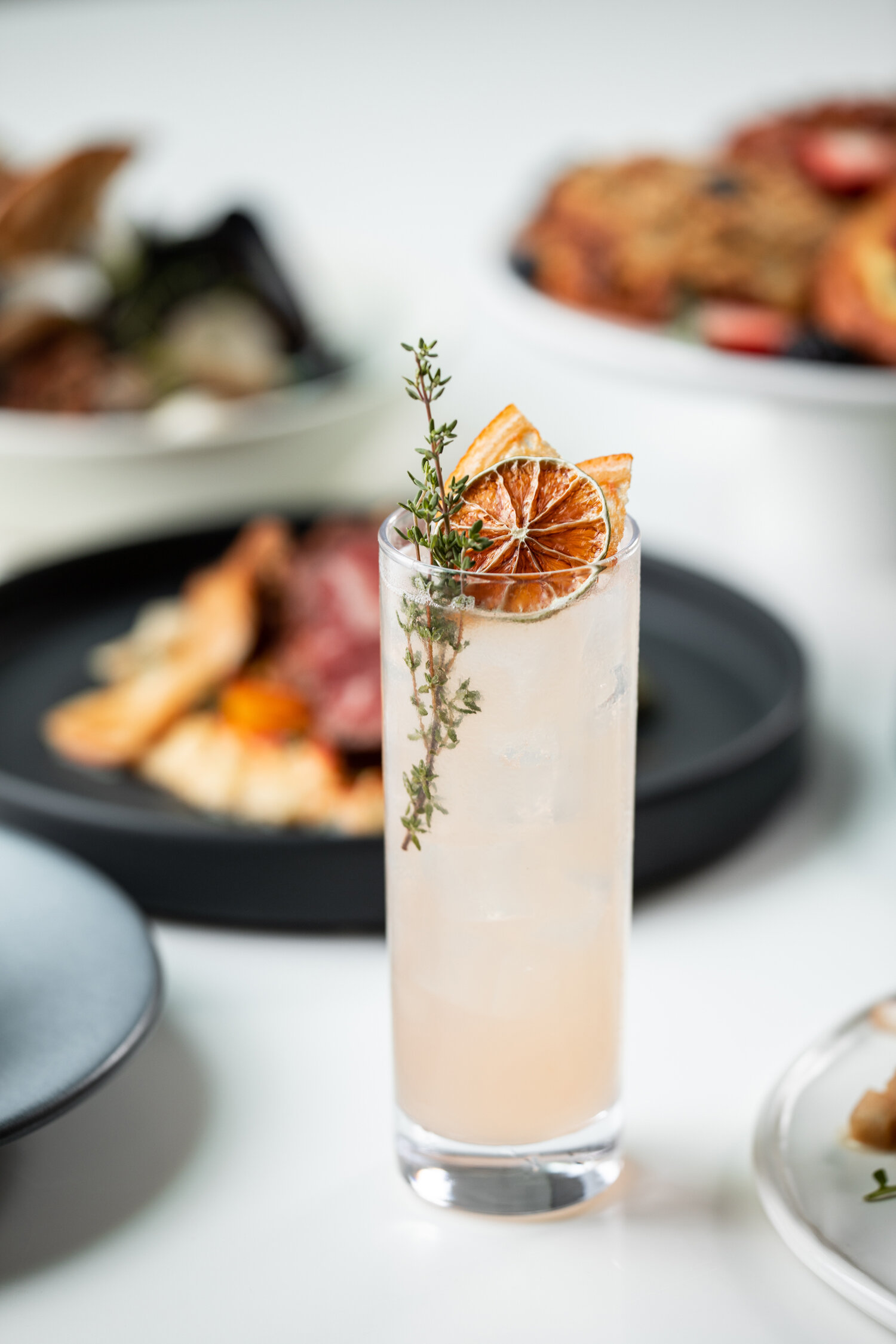
Situated in the Trammell Crow Center in the Dallas Arts District, Sloane’s Corner is a comfortable Downtown Dallas eatery serving New American Bistro fare and craft cocktails. Having partnered with the NL Group on many culinary projects, including Dish and The Front Room, Banowetz + Company was eager to lend our perspective and creativity to launch this new dining experience. Named after the owner’s eight-year old daughter, B+C created a warm and inviting signature script as the main brand element and infused gestural paint splotches as an artful nod to the restaurant’s location. Pairing whimsical and elegant aesthetics, B+C rounded out the brand touchpoints with an array of restaurant signage and collateral, including menus, takeaway packaging, and business cards. The resulting brand and experience are equally modern and playful.


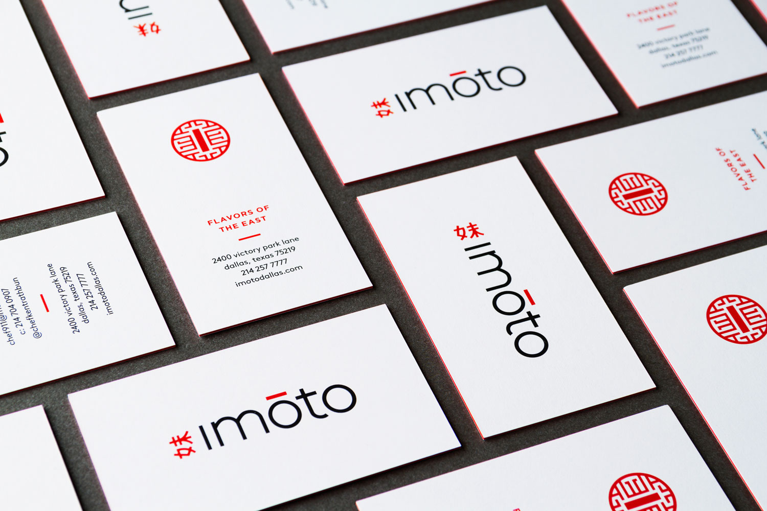
Delicious: Banowetz Creates New Branding for IMOTO

Culinary genius Kent Rathbun has done it again, launching a spectacular new dining and bar experience called IMOTO with his wife Tracy. Located in Victory Park, this upscale Asian restaurant is a flavorful signature showcase of Chef Rathbun’s take on Asian staples, traditional sushi and modern cocktails. With our history of working on successful restaurant concepts together, Banowetz + Company was invited back to the table to develop the branding for IMOTO. The B+C team crafted a series of sleek logo marks that fuse modern typography, bold splashes of color, and traditional Asian iconography, which made for dynamic signage and striking uniforms. The menus are wrapped in printed vinyl featuring art taken from the restaurant’s prominent wall mural, each one a unique piece of the overall image. Business cards were printed on decadent soft-touch heavyweight paper with an embedded hit of red for a look that makes a statement in any language.
— Team Banowetz


T45 Midtown Diner: A New Take on Classic Fare

We always strive to create engaging, quality work and pour ourselves into each challenge with which we are faced. Our clients recognize this and that's why it was no surprise when one of our long-time clients, Hyatt Hotels and Resorts, contacted us with the task of naming their new restaurant in Midtown, Manhattan.
On the street level of the Hyatt Times Square, you will find T45, a restaurant that puts a sophisticated, modern take on classic American fare. Mixing the energy of Broadway with an eclectic style, T45 creates a new dining experience that blends familiar retro elements with exciting modern touches.
We began with extensive research on the location, menu offerings and cultural influences of the restaurant. After narrowing our long list of carefully formulated names and taglines,"T45 Midtown Diner" was selected. The "T" symbolizes it's proximity to Times Square and the "45" represents it's location on 45th street.


Next, we crafted a logo that combined Broadway-inspired components with the restaurant's energetic and electric aesthetic. Finally, we began development of the menus, which delve deeper into the fusion of retro and modern. The design makes heavy use of overlaid illustrated elements from various eras as a nod to the eclectic nature of the restaurant itself.
Overall, the main thing we took away from this project is that working hard and having fun don't have to be mutually exclusive. Sometimes all you need is a bittersweet mixture of blood, sweat and (happy) tears to achieve success—to create something new yet instantly classic.
– DJ Sherman, Junior Designer
