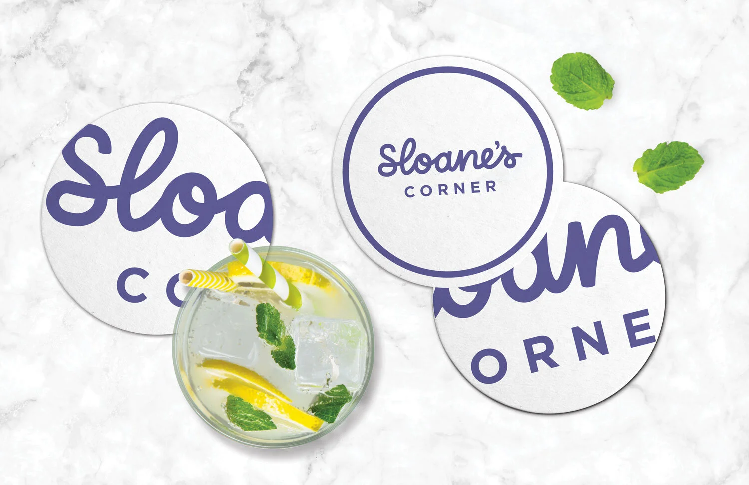
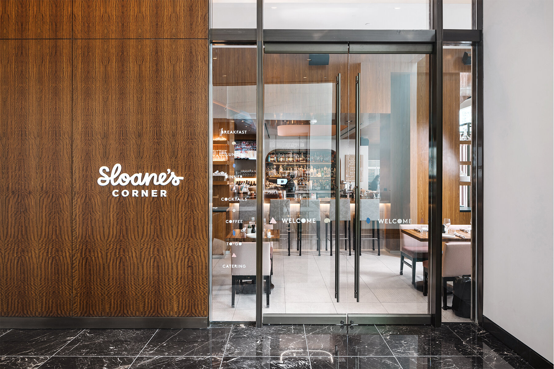
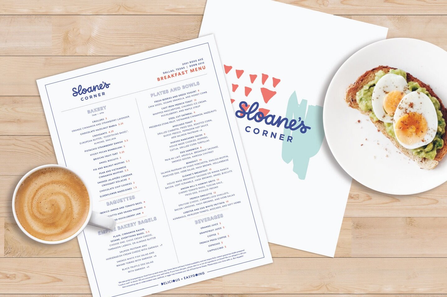
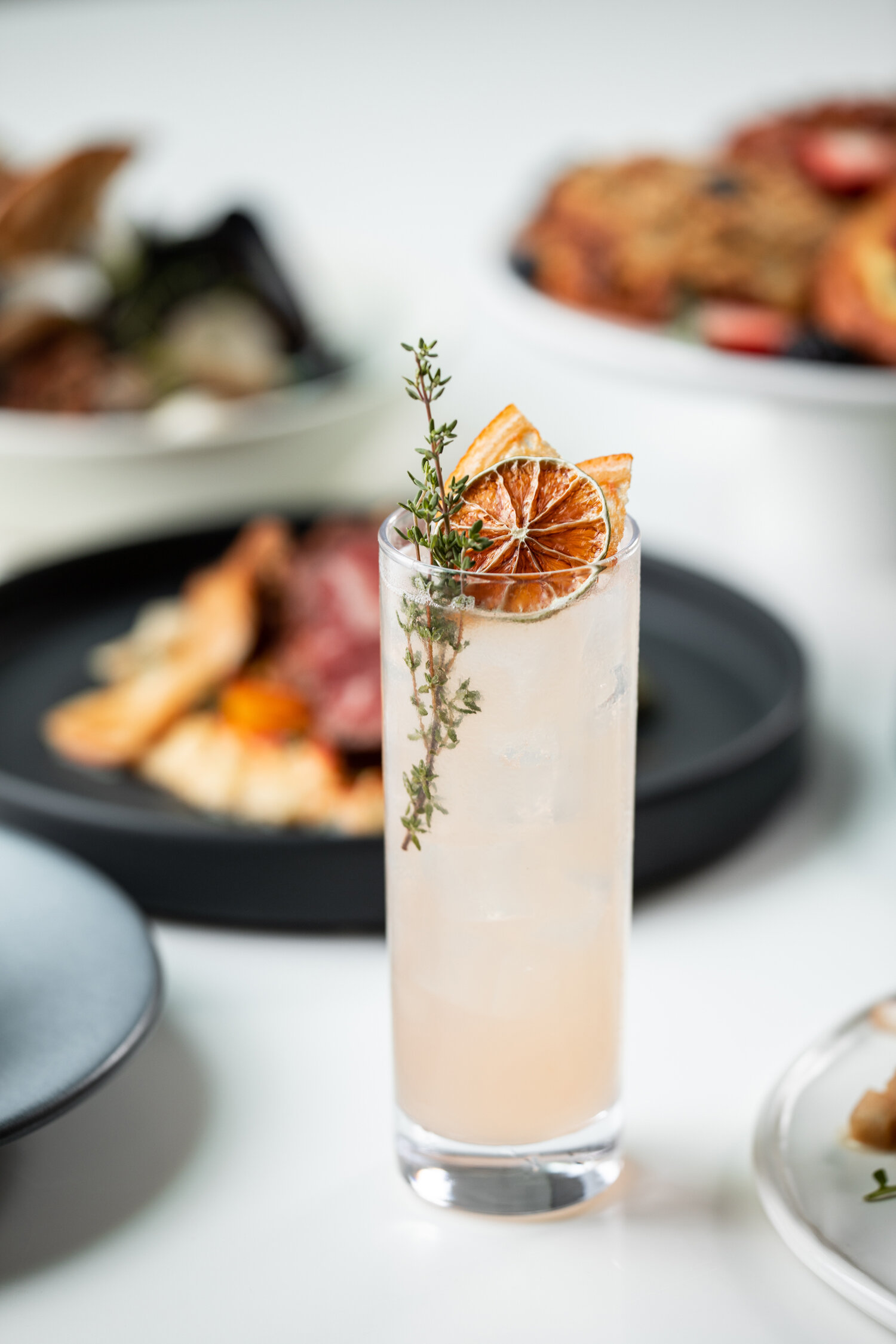
Situated in the Trammell Crow Center in the Dallas Arts District, Sloane’s Corner is a comfortable Downtown Dallas eatery serving New American Bistro fare and craft cocktails. Having partnered with the NL Group on many culinary projects, including Dish and The Front Room, Banowetz + Company was eager to lend our perspective and creativity to launch this new dining experience. Named after the owner’s eight-year old daughter, B+C created a warm and inviting signature script as the main brand element and infused gestural paint splotches as an artful nod to the restaurant’s location. Pairing whimsical and elegant aesthetics, B+C rounded out the brand touchpoints with an array of restaurant signage and collateral, including menus, takeaway packaging, and business cards. The resulting brand and experience are equally modern and playful.


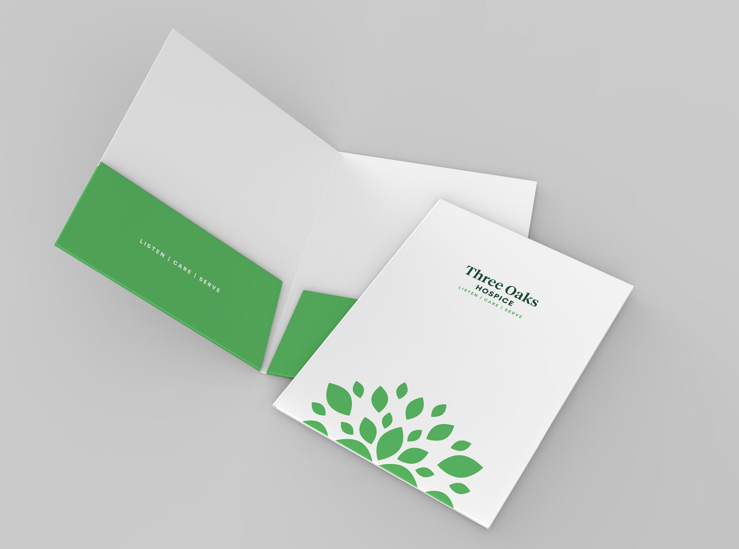
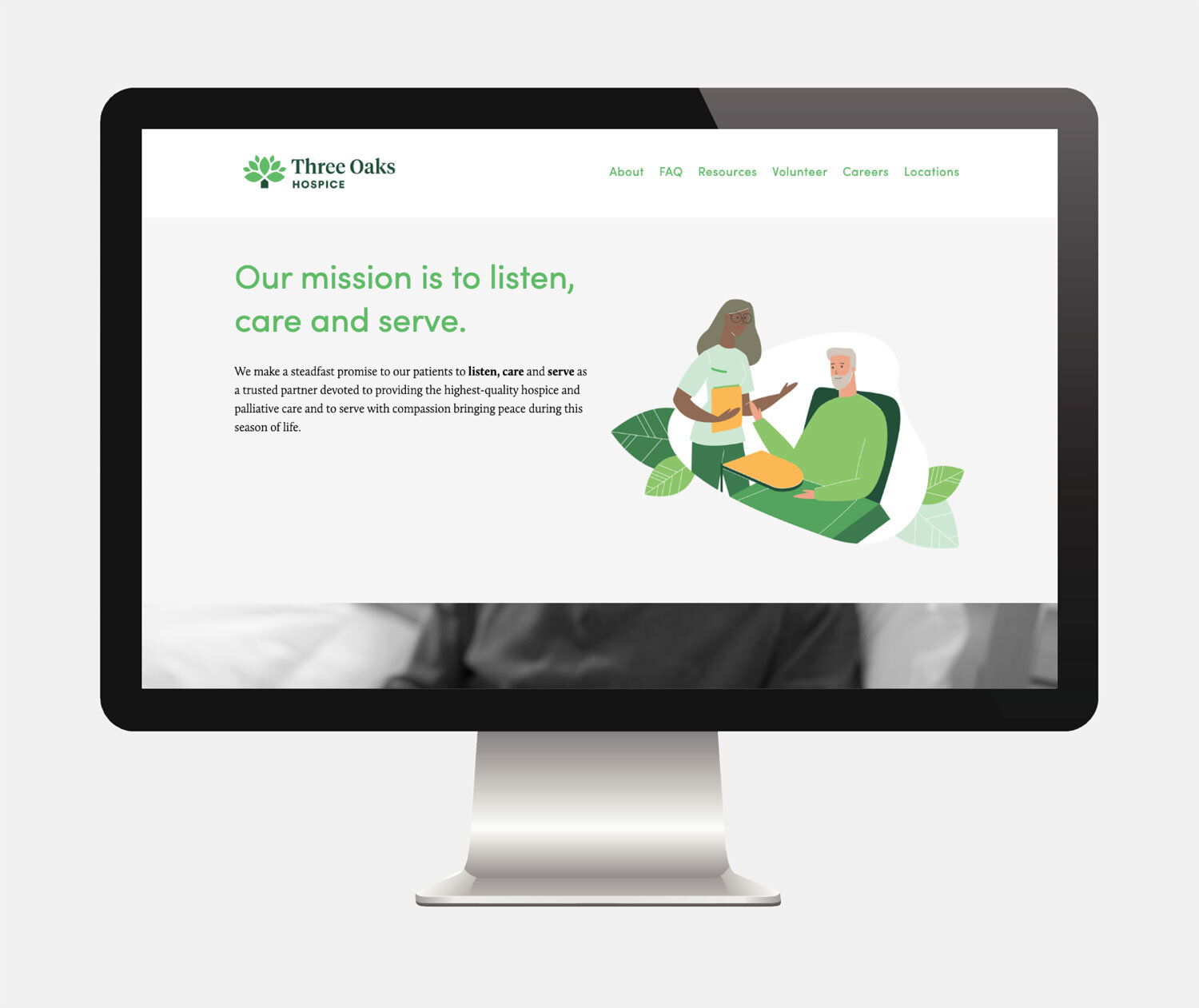
A Trusted Partner: B+C Brands Three Oaks Hospice

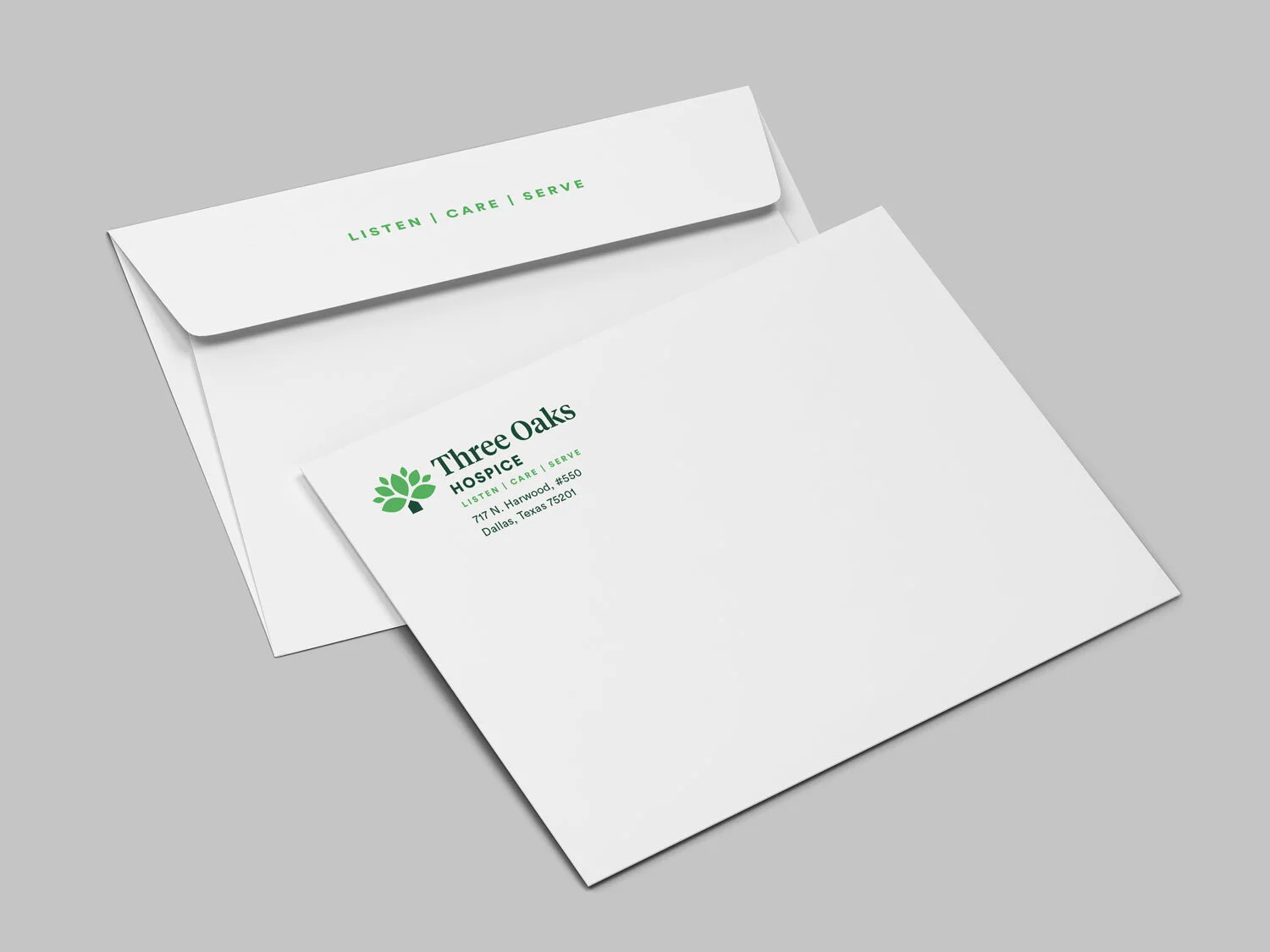
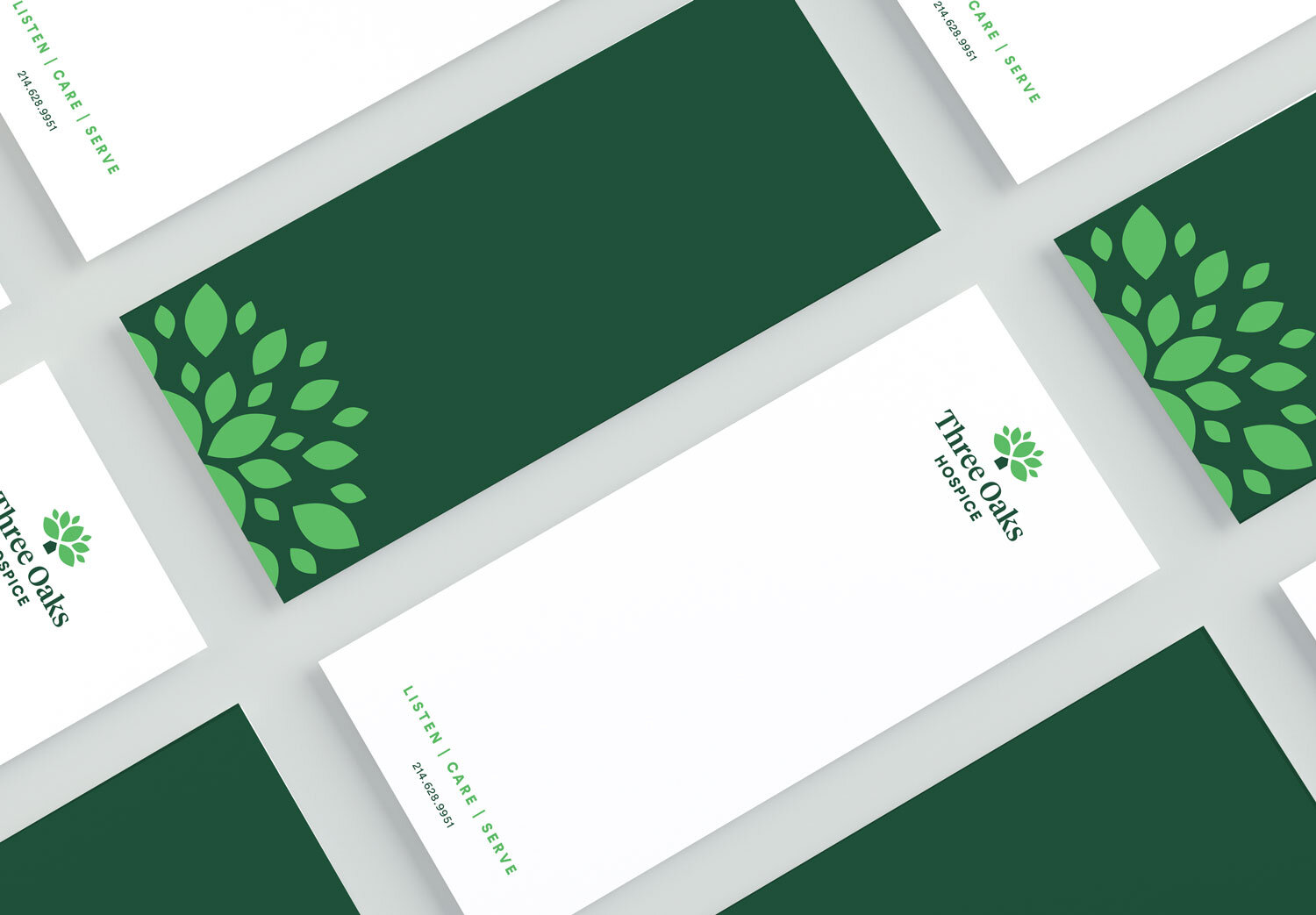
With a collective 100+ years of experience in the hospice industry, Three Oaks Hospice recently partnered with Banowetz + Company to launch their brand within the in-home hospice and palliative care space. With a steadfast promise to listen, care, and serve patients and their families during a critical time of life, B+C carefully crafted branding, collateral, and a website to emphasize the company’s mission. The identity features a strong oak tree with three dominant leaves, representing the three pillars of the Three Oaks brand, amid a cluster of smaller leaves, all of which surround a house-shaped icon as the trunk of the tree. This simple and powerful presentation represents the network of support provided to a patient during their end-of-life journey. Banowetz + Company developed the corporate website as a digital centerpiece for the brand, complete with clear and caring messaging, friendly custom illustrations, and easily accessible resources.


Good to Grow: B+Co New Work for Dallas’ Premier Landscaping Company

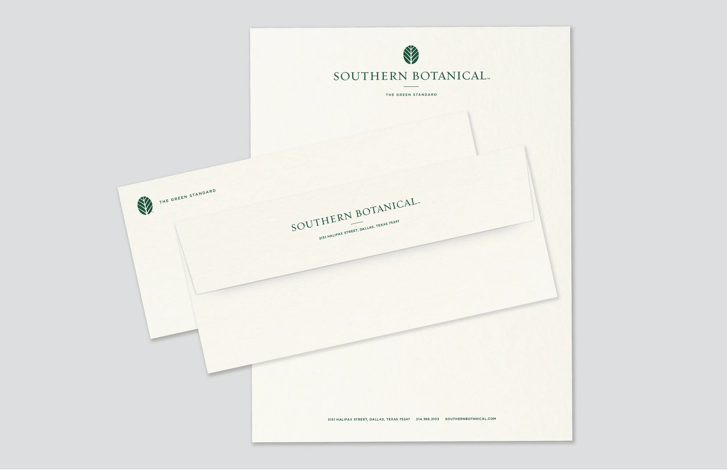
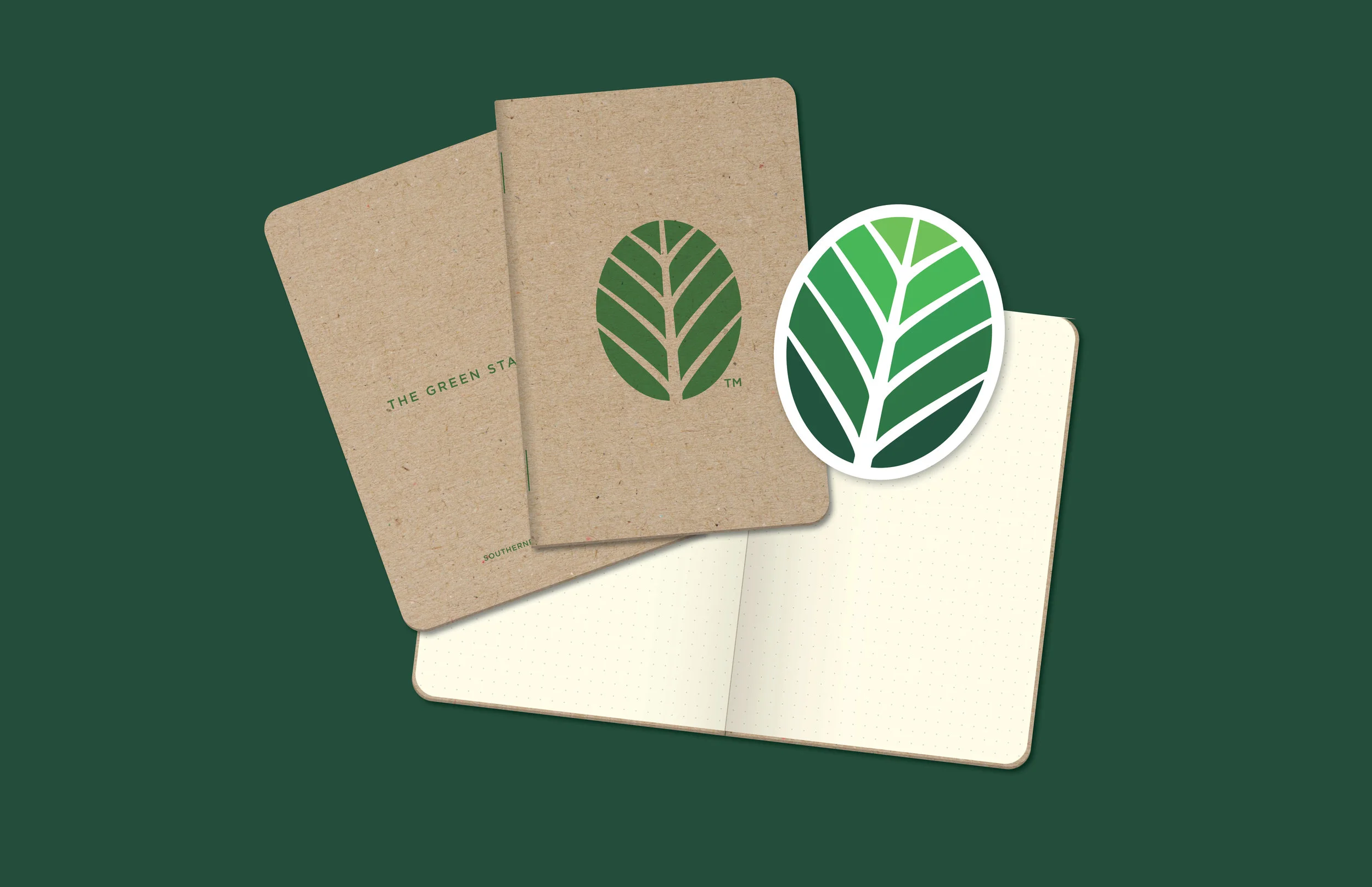
When Dallas-based landscaping company Southern Botanical needed a fresh approach to their brand, Banowetz + Company was eager to dig in. In business since 1995 and having experienced substantial growth since its inception, Southern Botanical was due for an updated look. The opening of a new corporate headquarters presented a perfect opportunity to rethink everything from the ground up. B+C first created a strong, modern logo and positioning line to succinctly communicate the nature of their business, which was emblazoned on their new building, stationery, vehicles, uniforms and swag. We then revamped the look and voice of their email and marketing materials with simple, eye-catching visuals and smart messaging to create a cohesive brand image. Now, with the recent launch of their redesigned website, Southern Botanical is perfectly positioned to successfully cultivate more business as “The Green Standard.”